|
Navigate
Sponsors
|
CSS Visual FiltersIntroductionThis guide shows you how to apply visual filters to text with CSS. Tested in Note: This is IE only. CSS3 might bring something new! Alpha FilterCSS Code Example: <span style="FILTER: Alpha(Opacity=80, FinishOpacity=70, Style=2); font-size:20pt;">Alpha Filter</span> Result:
Possible Parameters:
Blur FilterCSS Code Example: <span style="filter: blur(add=false, direction=135, strength=6); font-size:20pt;width:200px;">Blur Filter</span> Result:
Possible Parameters:
Glow FilterCSS Code Example: <span style="FILTER: Glow(Color=#ff0000, Strength=8); width:200px;font-size:20pt;">Glow Filter</span> Result:
Possible Parameters:
Drop Shadow FilterCSS Code Example: <span style="FILTER: DropShadow(Color=#0066cc, OffX=5, OffY=-3, Positive=1);width:300px;font-size:20pt;">DropShadow Filter</span> Result:
Possible Parameters:
Shadow FilterCSS Code Example: <span style="FILTER: Shadow(Color=#00cc66, Direction=45);width:200px;font-size:20pt;">Shadow Filter</span> Result:
Possible Parameters:
Wave FilterCSS Code Example: <span style="FILTER: Wave(Add=1, Freq=2, LightStrength=30, Phase=20, Strength=7); width:200px;font-size:20pt;">Wave Effect</span> Result:
Possible Parameters:
FlipV FilterCSS Code Example: <span style="FILTER: FlipV; width:200px;font-size:20pt;">FlipV Filter</span> Result:
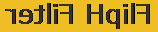
FlipH FilterCSS Code Example: <span style="FILTER: FlipH; width:200px;font-size:20pt;">FlipH Filter</span> Result:
Possible Parameters:
Chroma FilterCSS Code Example: <span style="FILTER: Chroma(Color=#9999cc); width:200px;font-size:20pt;">Chroma Filter</span> Result:
Possible Parameters:
Grayscale FilterCSS Code Example: <span style="FILTER: Gray; width:300px;font-size:20pt;">Grayscale Filter</span> Result: ?
Possible Parameters:
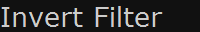
Invert FilterCSS Code Example: <span style="FILTER: Invert; width:300px;font-size:20pt;background:#eeeeee;">Invert Filter</span> Result:
Possible Parameters:
Light FilterCSS Code Example: <span style="FILTER: Light; width:200px;font-size:20pt;">Light Filter</span> Result:
Possible Parameters:
Mask FilterCSS Code Example: <span style="FILTER: Mask(Color=#9999cc; width:200px;font-size:20pt;">Mask Filter</span> Result:
Possible Parameters:
X-Ray FilterCSS Code Example: <span style="FILTER: Xray; width:200px;font-size:20pt;background:#eeeeee;">X-Ray Filter</span> Result:
Possible Parameters:
Have fun!
|
|
CSS Tutorials |
 |

Copyright © 2007-2025
SSI-Developer.net. Some rights reserved.
This work is licensed under a Creative Commons License.
This work is licensed under a Creative Commons License.